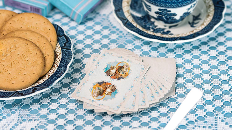
I have both sets of kittens: original and blue. The latter is more than just a palette swap of the former. I believe this listing is for the original, despite the picture that's showing as I write this. I'll go ahead and review both here, as I would have loved to see the differences laid out before buying any.
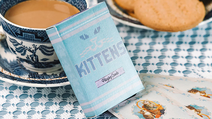
Starting with the theme, these are intentionally awful decks. The kittens are saccharine and I weirdly love them for that. While they're wholeheartedly meant for magic, I'd really like to play a few games with these over tea with some floral teapot as the pictures suggest.
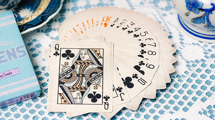
Ad copy elsewhere tells me that they're USPCC crushed premium stock, whereas the blues are on Cartamundi stock. Both feel great in the hands, though the originals feel a touch stiff for crushed premium. In this case, I'm comparing them to the Mint V2 decks, which feel like butter. The originals are traditionally cut and faro easily. I'm not sure about the cut on the blue ones. In both cases, the cards are physically good quality.
The tuck cases continue the over-the-top kittens aesthetic. The originals are in a plain-feeling box, while the blues have some nice spot UV adding texture to the knit print. I notice that the originals have Daniel Madison's signature "M" on the back while the blues don't. I suspect this comes down to one being his creation and the other being a remix by Ellusionist. Both boxes have a card reveal hidden on the inner tabs. While the reveal is obvious, it meshes well with the overall saccharine knit theme and so defies notice.
Both decks are marked as readers. This is one of the first real points of difference between the two editions. The originals have the markings hidden within the ribbon border. They're hard to find, even when you're looking for them, but also difficult to read if more than a foot from my eyes. Even when otherwise legible, the spade and club symbols are difficult to tell apart. There is a grainy texture to the print there that is just enough visual noise set against just small enough of a symbol to cause difficulty. The blues have the marks much larger within the dotted background of the cards. They're much easier to read, but I fear they're large enough and obvious enough that they would be discovered. There was also a printing error and the diamonds are marked in reverse order. (e.g. the marks for deuces and queens are swapped.) The originals also have an oft-overlooked feature in that they have subtle one-way backs. I really like it when a deck design manages to quietly do this. There is a dot of dirt under the handle of one basket, but not the other. I did not see this feature on the blues.
Speaking of the distressed pattern, this is another point of difference in the decks. The original Kittens has a fairly strong distressed pattern printed onto them, while the blues have a softer distress pattern. The best way that I can describe it is that the originals look like they got specks of mud flung at them while the blues got dipped in muddy water. The trouble with the mud speckles is that they're obviously printed on and they're in the same pattern on each card. Spread the cards ever-so-slightly and you can see the pattern repeat, ruining the illusion that they're dirty. With the blues, it's still the same pattern from card to card, but it calls much less attention to itself. They just look grimy, but plausibly so.
On to gaffs, both decks forewent having jokers to pack in an extra pair of gaff cards to mixed results. Both have a duplicate ace of spades where there is a bird in the background, in contrast to the normal ace of spades in which the cat is covered in the bird's feathers. This one is fun for color changes or for messing with people's senses. Both have a split-face card for the three of diamonds and ace of clubs, which is really useful. Both also have an Angle-Z gimmick card, which seems way too specific in use and (so far as I can tell) is a one-shot effect requiring the destruction of a card. This feels like a waste to me. Finally, the originals have a duplicate nine of spades with the yard balls missing from the card back while the blues include a double-backer. Double-backers seem so generally useful that I'm surprised the original Kittens skipped them for something with less utility.
I think all in all, I prefer the blue Kittens. That said, I have a couple of copies of each and pull them out for the split-face (Monte) gimmick and still imagine pulling them out for a ridiculous time playing a game.