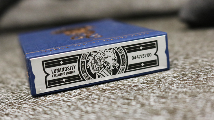
Luminosity (KSX)
$22.00
Out of stock
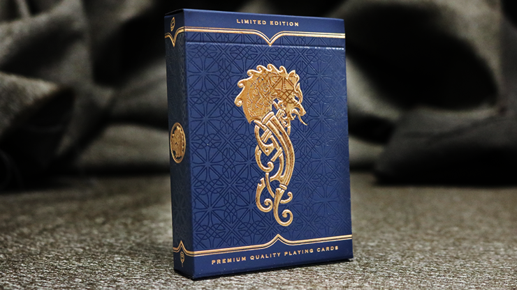
LIMITED EDITION: Only 3700 printed! Will NOT be reprinted. Numbered custom seal.
Luminosity Playing Cards is a custom deck with a story. Created by Jody Eklund and written by Ricky Cassford. The deck reveals an allegory depicting the age-old conflict between good and evil. Visually inspired by Norse mythology, we have created a rich narrative representative of a deeper spiritual meaning that is brought to life through this set of unique and custom-illustrated playing cards.
THE STORY
The Lucent Lands were once a utopia of peace and power. Safe behind guarded borders, every creature that came out of the Cave of Creation lived in a haven of prosperity and wealth, provided by the eldest among them, Ahendhal. The kingdom of The Lucent Lands could not be overcome from beyond its borders, but that was before The Fracture that came from within. The Fracture split more than the kingdom, it divided families. As brother fought brother, reinforced by the armies of their respective houses, Ahendhal enslaved them both and banished the treacherous brother along with his faction into the lower part of the land, which to this day is called the Shadowlands. The Faction War raged on for nearly a century with no end in sight. Then a new creature came from the Cave of Creation, which changed the course of the Faction War. This creature was prized by Ahendhal as the pinnacle of creation, and was prophesied to rule over the factions. This enraged Kapshunis, the King of the Shadowlands, and inspired him to change his tactics to those of vindictiveness and malice toward Ahendhal's prize.
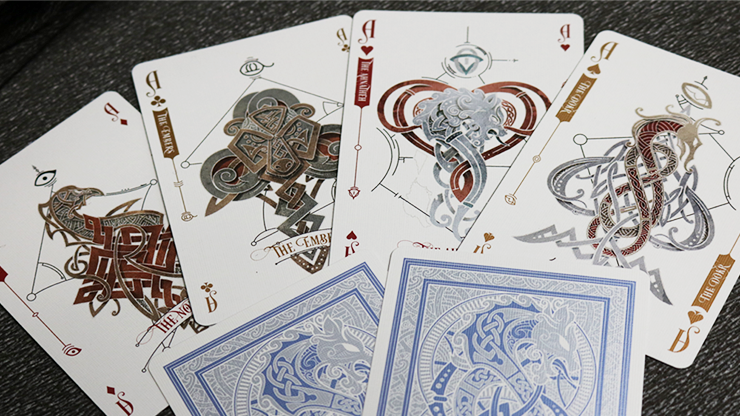
CARDS
Luminosity Playing Cards is a custom deck with a story. Created by Jody Eklund and written by Ricky Cassford. The deck reveals an allegory depicting the age-old conflict between good and evil. Visually inspired by Norse mythology, we have created a rich narrative representative of a deeper spiritual meaning that is brought to life through this set of unique and custom-illustrated playing cards.
THE STORY
The Lucent Lands were once a utopia of peace and power. Safe behind guarded borders, every creature that came out of the Cave of Creation lived in a haven of prosperity and wealth, provided by the eldest among them, Ahendhal. The kingdom of The Lucent Lands could not be overcome from beyond its borders, but that was before The Fracture that came from within. The Fracture split more than the kingdom, it divided families. As brother fought brother, reinforced by the armies of their respective houses, Ahendhal enslaved them both and banished the treacherous brother along with his faction into the lower part of the land, which to this day is called the Shadowlands. The Faction War raged on for nearly a century with no end in sight. Then a new creature came from the Cave of Creation, which changed the course of the Faction War. This creature was prized by Ahendhal as the pinnacle of creation, and was prophesied to rule over the factions. This enraged Kapshunis, the King of the Shadowlands, and inspired him to change his tactics to those of vindictiveness and malice toward Ahendhal's prize.
CARDS
- Printed by USPCC
- Poker size
- Air cushion embossed card finish
- Premium Casino grade paper stock
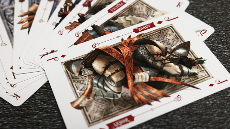
- 56 completely custom playing cards (each Court, Ace and Joker will have original illustrations)
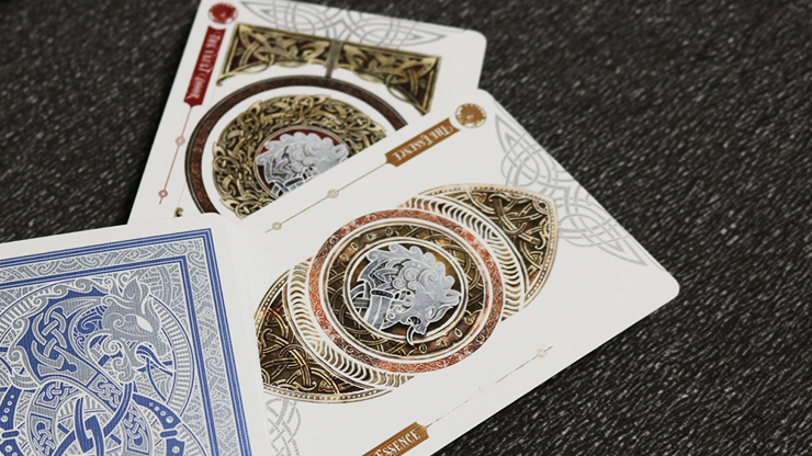
- Backs have 2 metallic copper inks
- Produced by GAMBLER'S WAREHOUSE
- A soft-touch card stock will be used for the material
- The tuck case will have strategic EMBOSSING
- MADE IN THE USA
- Unique tuck case designs for all editions
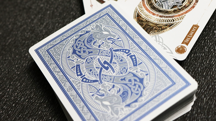
- BACKS
STD: Copper metallic ink
KSX: Blue metallic ink
LUX: Black & silver metallic inks - SIGNATURE CARD
STD: No
KSX: Yes
LUX: Yes - FACE CARDS
STD: Silver metallic ink as accents
KSX: Copper metallic ink for pips and indices
LUX: Copper metallic ink for pips and indices.