Customer Reviews

Based on 5 reviews
40%
(2)
60%
(3)
0%
(0)
0%
(0)
0%
(0)
B
Benjamin (Florissant, US)
Classic Aviators

A nice deck of classic cards. These Aviators get the job done. There's definitely nothing flashy about this deck, but it also handles very well.

S
Stephanie Boyle Mays (Bend, US)
aviator

Better looking in person than they are in the photos. I am just using these for playing cards with friends.

M
Marta Silva (Macao, MO)
Nice design

Cards are smooth and have a nice design

O
Ofek Azarya
Aviator

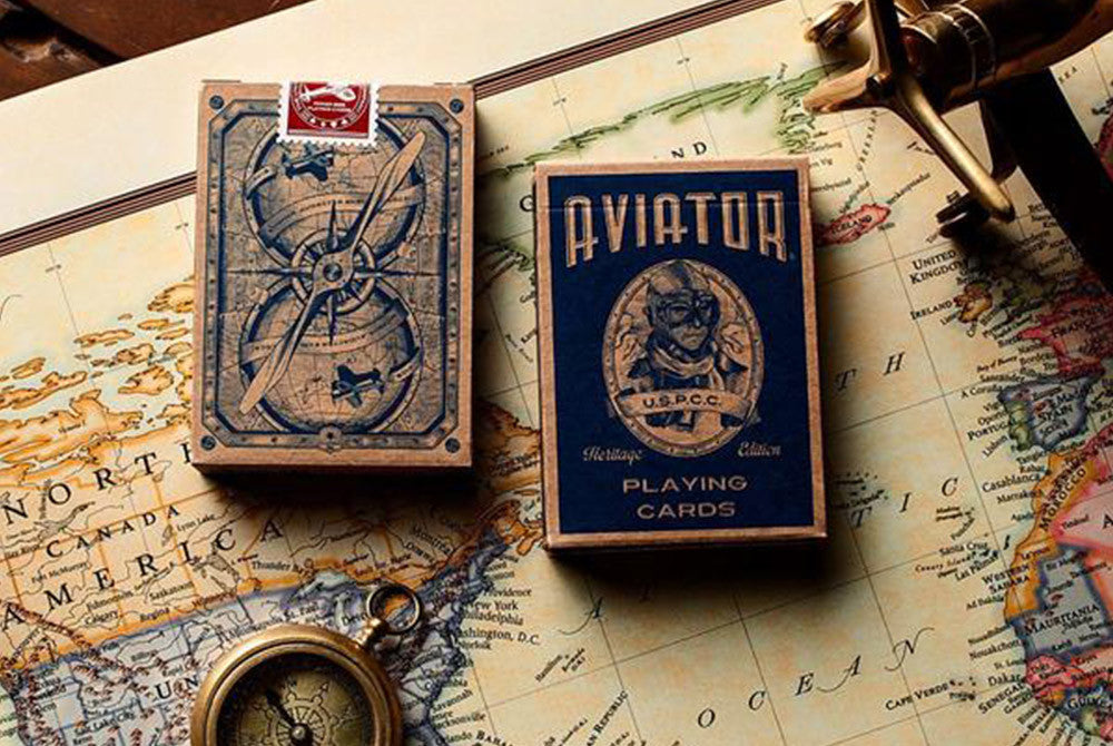
Design wise I love this deck, the back design reminds the standard look of bicycle but the theme is much better. The back design is one way but you wont notice it if you don't want to so don't put your mind in to it.
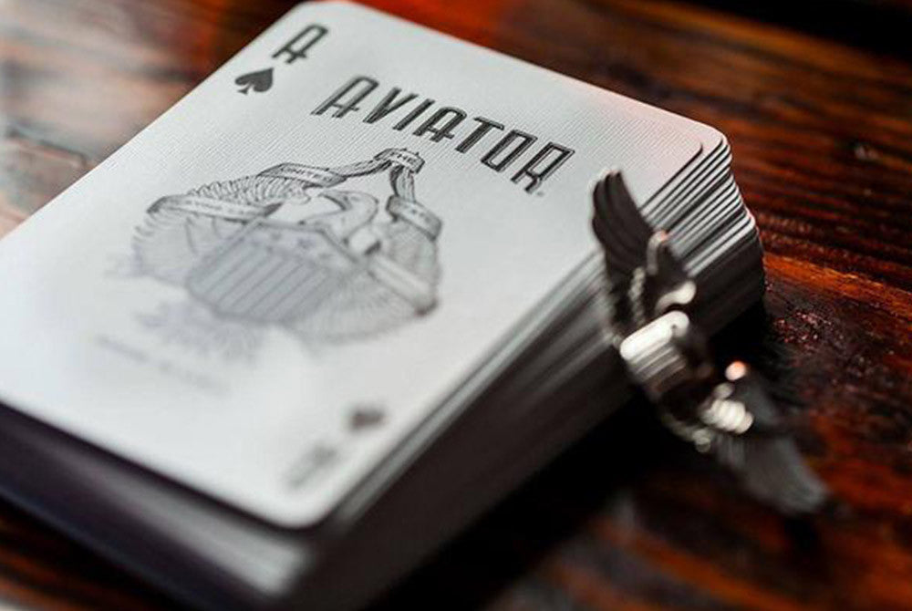
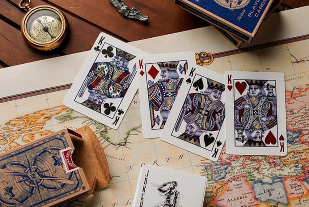
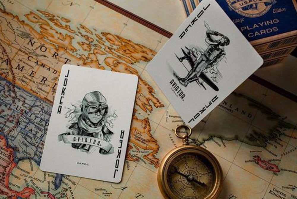
The core cards look metallic, that gives them a really cool look. The numbering is custom and a but weird but that shouldn't be much of an issue to anyone.
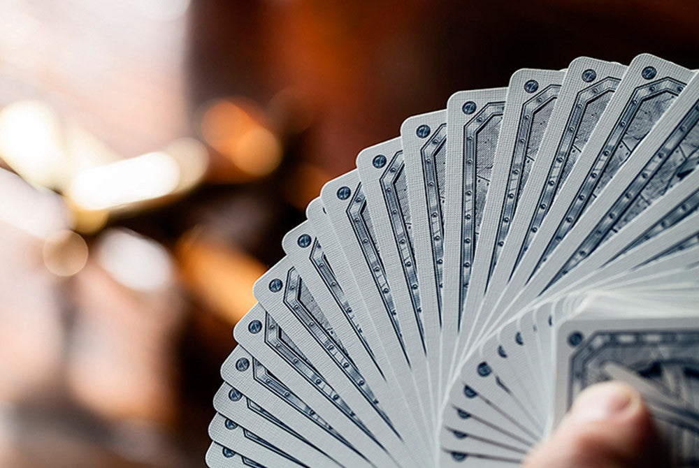
Handling wise the cards are really stiff out of the box but the do loosen up after a while, other then that they fan great and they keep fanning great after a lot of use. The cards are really thick so they probably won't fit in any of your cards clip (much thicker then a normal deck of cards, even bee stock deck).
Overall they have a unique feel to them, I won't recommend them as a first deck but they defently a must have if you already have a couple of decks, you won't get this card stock with any other deck I know (Its the only AOP deck I own so I'm not sure about the others).

T
Thomas J.
Handles great, but the cards has a one way design.

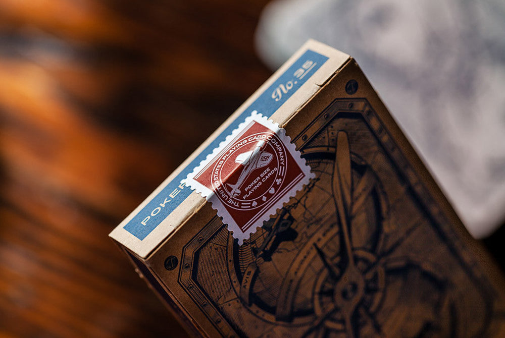
When i first got this deck in the mail, i was rather excited. With the first glance of the eye the design was very good and pleasing to the eye. the box has a brown cardboard finish with the designs in dark blue. On the front of the box it stood aviator and on the back it had the back design. when i first broke in to the deck of cards they were pleasing to the eye as well. Of course they had a very slickness to them when i first held them, but that is how every new deck is until you work them out so they become smooth. The handling on the cards was great and it was a very good deck of cards. I found it easy to do flourishes like the spring, Cascade, Dribble, Riffle shuffle and the faro shuffle. in the beginning i found it hard to do the friffle because of the slickness, but after a while when it was worked out, it felt good to do the friffle. To sum up the the last sentences it handled well and look good, but now to the negatives. The number font looked a bit wierd. the number three looked like a giraffe, same goes for the number six, and the number eight looked like an upside down letter i. I found out after a while of doing dribble and the riffle shuffle that it is a one way design. It is not very visual but i found that there was a different design on the top globe then the bottom globe on the back design. The top globe had a picture of south and north America with Hughes flying in his H-1 Racer, But on the bottom globe it is a picture of Hughes flying over east Asia. Of course this is not very visual but if spotted it can ruin a magic trick, how ever it can be used as an advantage.
To sum up and come to the conclusion i would say the deck looks really good except the font and handles pretty much like a high quality deck. The downside is that it is a one way design even tho it looks like a two way design. this can ruin a magic trick but can also be used as an advantage. I personally loved the deck, but i like for example the Jaqk Cellars and the Monarchs bette...